Designing a Product to Enhance Mental Health Assistance
Creating a comprehensive solution to promptly address the existing challenges

OVERVIEW
Sage is a mental health application that I designed through Springboard’s UI/UX Design Bootcamp. This case study showcases the design process I followed and the resulting solution that emerged from it.
THE PROBLEM
Mental health has always been a neglected area within the Healthcare Sector. These issues have been and continue to be stigmatized, especially in India. This has led to a lack of awareness about how to approach mental health issues.
Reaching out to the right counsellor/therapist is a daunting process. Further, there is a dearth of apps that focus solely on mental health assistance.
In 2020, the COVID-19 pandemic worsened the issue and significantly impacted people's mental health. Now, more than ever, individuals require a platform that allows them to access timely and effective assistance.
ROLE AND SCOPE
Timeline: December 2020 - March 2021 (16 weeks)
Role: Individual project
Scope: UI/UX Design
Software used: Figma, Miro, Marvel, Illustrator, Photoshop
DESIGN PROCESS
I utilized the user-centric design process, ensuring that I considered the needs of the end user at each stage.

DISCOVERY
The first step was to empathize with the users to better understand the problem space. This was done through primary and secondary research methods.
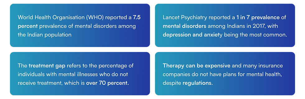
SECONDARY RESEARCH
I conducted secondary research by examining online editorials, articles, and similar sources to discover insights from existing data concerning mental health. Some of the key findings from this research were as follows:
COMPETITOR RESEARCH
I conducted competitor research by examining apps within the domain to observe how competitors are addressing this issue. The insights gained from this exercise were:
-
Apps like Practo and Meddo Health focus on the broader healthcare domain rather than specifically catering to mental health
-
Other apps like InnerHour, HeadSpace, and Mindshift help with relaxation and meditation but do not enable a user to seek professional help
PRIMARY RESEARCH
To validate the insights I gathered from secondary research and obtain real user perspectives, I conducted user interviews. I circulated a screener survey to 25 participants and selected 11 based on the following criteria:
-
Users who have sought therapy and users who have contemplated seeking therapy
-
Certified medical professionals dealing with cases of mental health issues
A graphical representation illustrating the statistics gathered from the user interviews is presented below:

The key insights obtained were as follows:
“There needs to be more awareness on mental health”
“There isn’t one single medium of seeking therapy leaving me feeling overwhelmed”
“I would trust a therapist who is recommended by friends or family”
“Cost, Specialisations, ratings are key factors when considering a therapist”
“With the COVID-19 pandemic, I prefer virtual therapy”
“I want my data to be safe and secure”
“I would like to be able to self-diagnose my symptoms”
DEFINE
Upon completing my research, I needed to synthesize the findings to define the problem area more clearly. To accomplish this, I used various UX tools in the following manner:
AFFINITY MAPPING
I created an affinity map to group the insights gathered from user interviews based on similarities in responses. I was able to categorize them into the these broad buckets:
-
Technical competency
-
Coping mechanisms
-
Causes and triggers of distress
-
Mediums of seeking therapy
-
Key factors when finding a therapist
-
Virtual therapy preferences

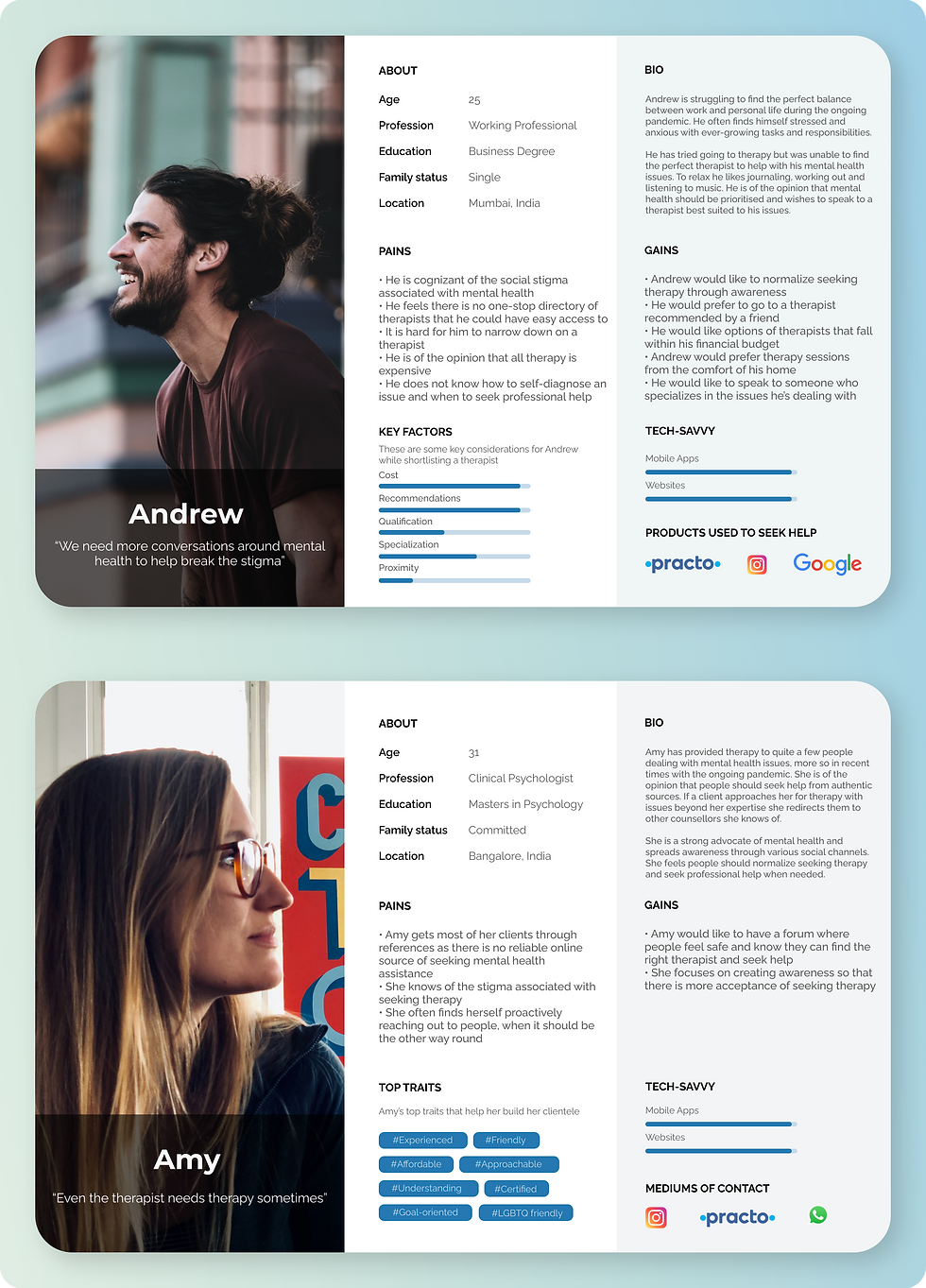
USER PERSONAS
I identified two user personas that represented the type of users who would be using the solution to help me ideate solutions tailored specifically for these user groups.
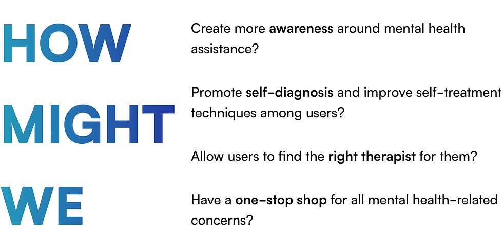
PROBLEM STATEMENTS (HOW-MIGHT-WE QUESTIONS)
Through synthesizing the research, I arrived at the core problem statements that needed to be solved
IDEATE
The next step in the design process required creative thinking to generate multiple solutions and ideas aimed at addressing the identified problem statements. I devised solutions that stemmed from the insights, considering user pain points and focusing on the following aspects:
-
Allow the user to read and share articles on mental health
-
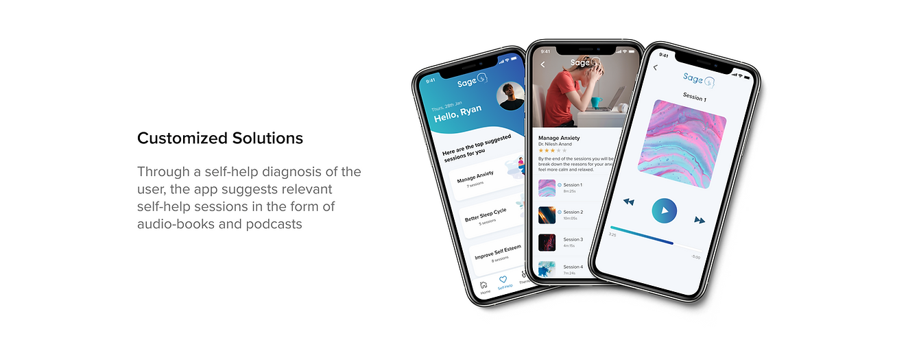
Find a way for the user to self-diagnose symptoms
-
Enable the user the option to avail of self-treatment
-
Find the right therapist through a smart algorithm that filters therapists based on inputs from the user
-
Promote virtual consultation during the pandemic

INFORMATION ARCHITECTURE
To begin designing the product, I created an information architecture serving as the app's blueprint. This was achieved by using the following tools:
SITEMAP
I created a sitemap of the product to establish a hierarchy and understand how the various screens and modules are linked within the product.
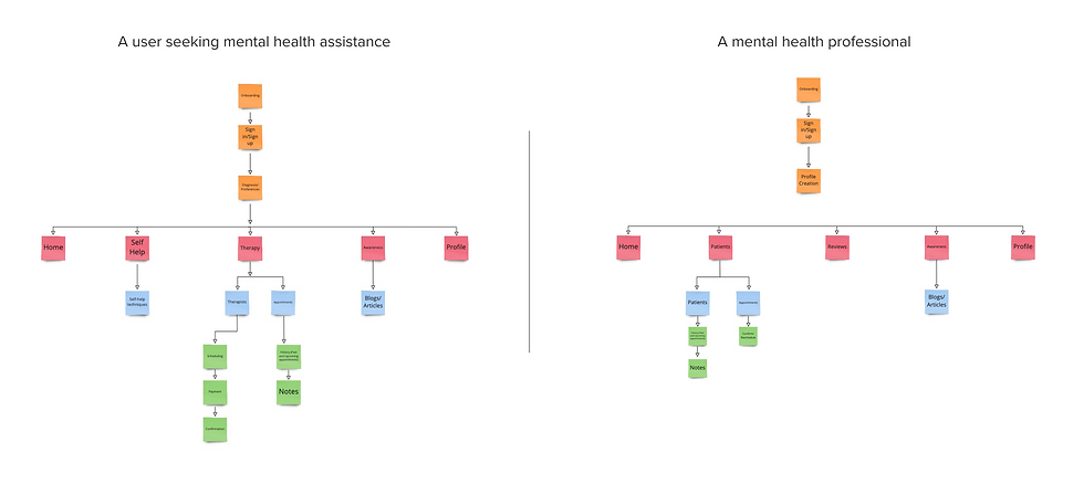
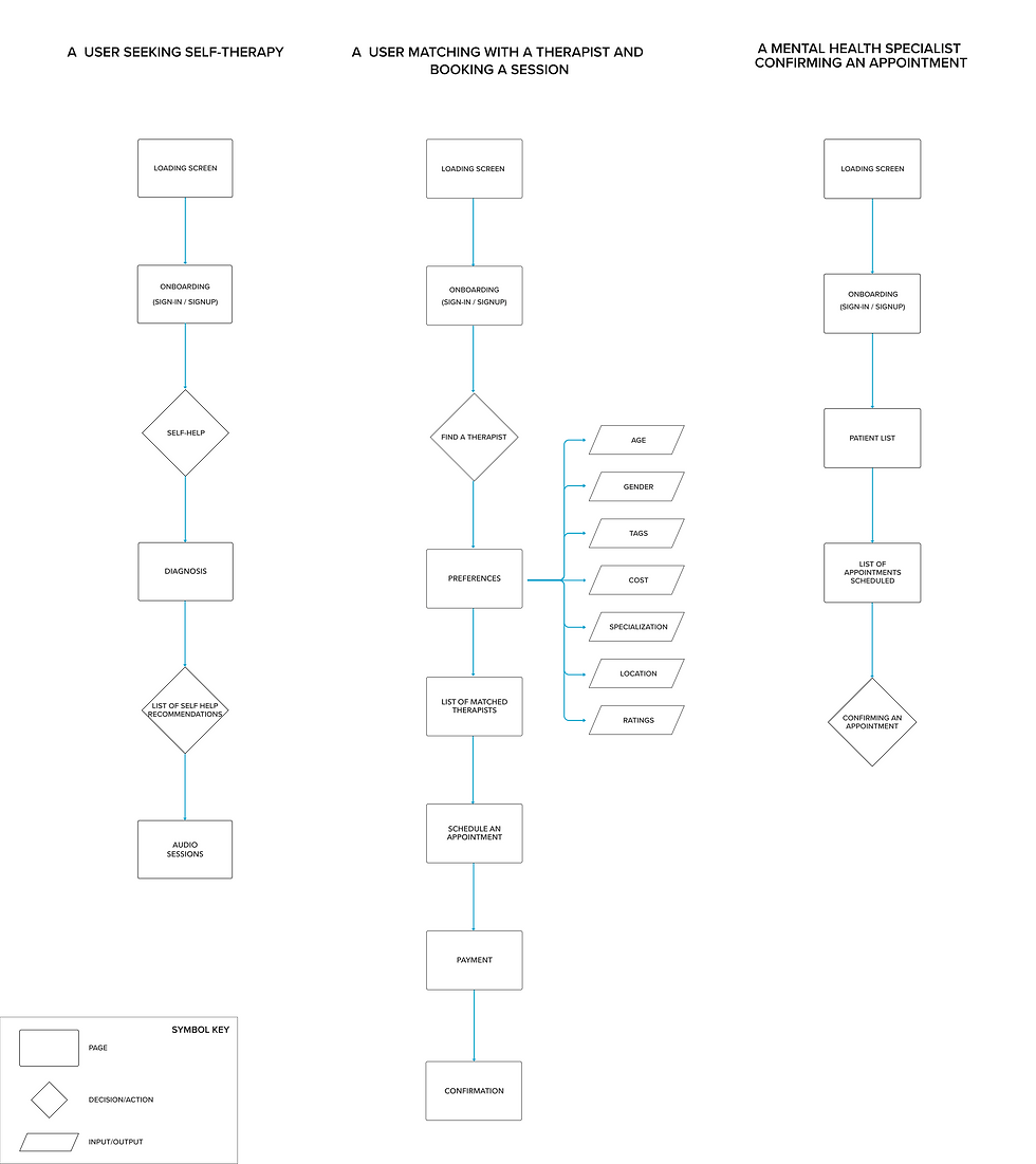
USER FLOWS
I designed three user flows that cover the most vital routes users would take to accomplish key milestones on the application:
DESIGN
With the product structure established, I progressed to the next phase which was designing the different screens and modules for the application.
SKETCHING
Initially, I began with low-fidelity sketches on paper, creating sketches for the screens outlined in the user flows to visualise how they would translate to mobile devices, given that this was a mobile-first application.

GUERILLA USABILITY TESTING
Using this paper prototype, I conducted five guerilla usability tests with users to identify potential usability issues and collect initial feedback on the designs. The following tasks were assigned to each user:
Applications used: POP by Marvel
Tasks:
Task 1: Use the application to access mental health assistance that doesn't rely on professional support.
Task 2: Use the application to search for mental health professionals and book your first counselling session.
KEY LEARNINGS
-
The initial designs featured a card-matching system (similar to the interface seen in certain dating apps) that users found confusing. One user expressed that the card format in the sketches could induce anxiety. Consequently, I replaced the card system with a more straightforward and concise list.
-
Some users noted that they felt unsure about the number of therapists available on the platform because they were presented with a lengthy list without any indication of the total available options. To address this concern, I added a screen indicator that informed users of the total shortlisted therapists based on their inputs. This indicator provided users with clarity regarding the specific number of options available to them.
-
I introduced a "Sort by" option on the therapist's screen to facilitate a secondary level of sorting within the list.
These inputs were instrumental in identifying and resolving issues promptly before moving to wireframing.
LOW FIDELITY WIREFRAMES
I then moved on to convert the paper sketches into low-fidelity digital mockups. These black and white prototypes helped me to design the skeleton of the screens without incorporating visual design aspects such as typography, color, iconography, and so forth.

BRAND IDENTITY
Following that came the phase where I focussed on establishing a brand identity to define the visual language to be used throughout the application.

HIGH FIDELITY WIREFRAMES
I proceeded to integrate the visual design elements to develop high-fidelity mockups.

Some of the key solutions proposed were as follows:


TESTING
In the final stage of the design process, I tested the prototype with real users. To ensure the best results, I conducted two rounds of moderated usability tests, with 5 users participating in each round. The goal of these tests was to identify any usability issues and gather feedback on the experience of the product.
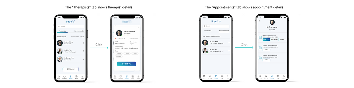
Issue 1: The users found it difficult to navigate the therapy tab, unsure of how to book and start sessions.
Solution: To resolve the problem, I separated the therapist and appointment information into two separate tabs. The therapist tab was used for viewing therapist details and booking sessions, whereas the appointment tab contained information on past appointments as well as upcoming ones. After implementing these changes, the second round of usability tests confirmed that the issue had been resolved.
Issue 2: Users were unable to find the "Proceed to Pay" button easily on the confirmation screen as it was placed at the bottom of the page.
Solution: As this was a confirmation summary page, I condensed it while ensuring all necessary details, including the "Proceed to Pay" button, were placed in the first fold. This adhered to the best practice for summary pages, eliminating the necessity for users to scroll down.

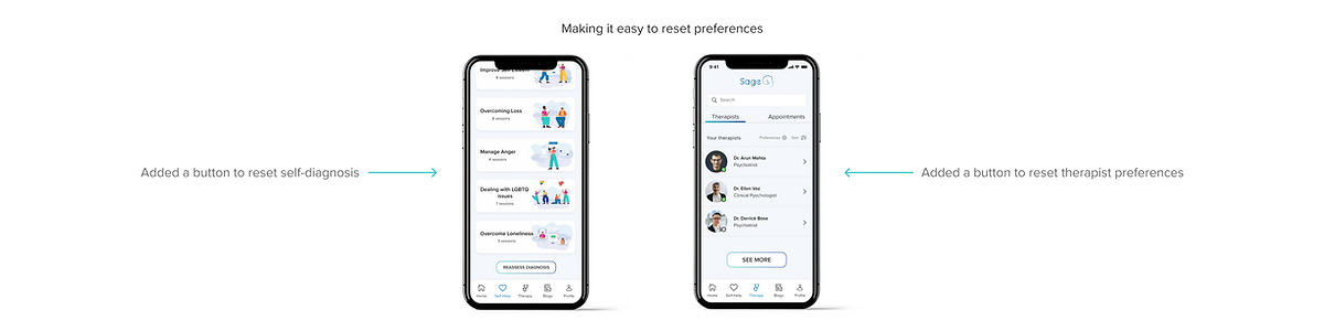
Issue 3: Users were unable to reset their preferences to access their self-diagnosis or find a therapist.
Solution: Besides the "reset preferences" option already available in the "Profile" tab, I added a button to reset preferences in the "Therapy" and "Self-Help" tabs to make it more intuitive.
Issue 4: Users had requested the addition of a "Pay Later" option in the payments tab.
Solution: Implemented this option so users could pay in cash if they booked an in-person appointment

DESIGNING FOR EDGE CASES
Designing for edge cases, which are infrequent interactions that might disrupt the user experience, is a wise practice. Recognizing this, I anticipated potential edge cases and incorporated design solutions in advance, ensuring a more robust user experience.

DESIGNING FOR ACCESSIBILITY
While designing, I ensured that the designs were accessible to everyone. By considering accessibility parameters during the design process, I ensured that everyone, including people with disabilities, could use the product. This approach helped me to create an inclusive product that was accessible to the masses.
Major Considerations:
-
I verified that the contrast between text and background meets WCAG standards.
-
I've added outlines to buttons that previously relied only on colour to indicate active states. This change ensures that colour isn't the sole indicator, aiding individuals with colour blindness.
-
To improve identification in error states, I incorporated a red outline and introduced an error icon. This adjustment ensures better recognition, avoiding reliance solely on color as the indicator.
CONCLUSION
This case study has been an invaluable learning journey—from identifying the problem to executing the solution. The design thinking process stages acted as a guide throughout this journey.
In today's context, mental health awareness is crucial, and tools like Sage play a vital role in simplifying the options accessible to individuals seeking assistance.
In future updates, I aim to incorporate additional features like:
-
Enabling users to connect their insurance plans to cover therapy sessions within the app.
-
It would be helpful to have a chat feature connecting users to a therapist for urgent conversations.
-
Additional standard features including notifications, smart calendaring, social sharing, and more.
Thank you for taking the time to read my case study. I hope you found it helpful. Always remember to prioritize your mental health, as it is crucial for your overall well-being. Have a great day! 😊