Improving Social Engagement on an Event Management Platform
The aim was to discover solutions that would enhance the RSVP-to-Attendance Ratio

OVERVIEW
As part of Springboard’s Industry Capstone Assignment, I was given the following scenario:
A startup company has launched a new product that helps people make friends and attend events. The goal of the product is to create social engagement that will motivate users to attend events and meet more people.
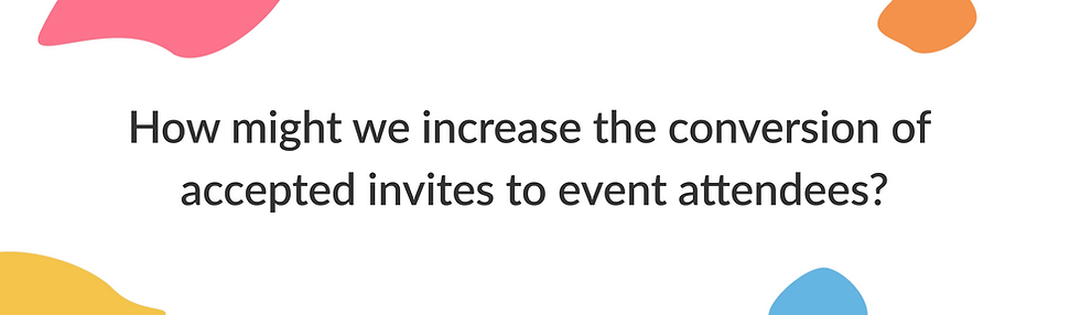
THE PROBLEM
The business team has realized that the number of people who book events is significantly higher than the number of people who attend these events. Company data shows that on average only 20% of those who sign up actually attend.
The problem statement statement that needed to be solved was:
ROLE AND SCOPE
Timeline: May — July 2021
Role: Individual project
Scope: UI/UX Design
Softwares used: Figma, Miro, Marvel
KEY STAKEHOLDER INSIGHTS
The business team provided specific reasons for their perception of a low conversion rate. These reasons included:
-
Users may not be getting effective communication about upcoming events (eg. Emails, reminders, etc.)
-
Users might require an incentive to attend, but this incentive should be cost-effective for the company.
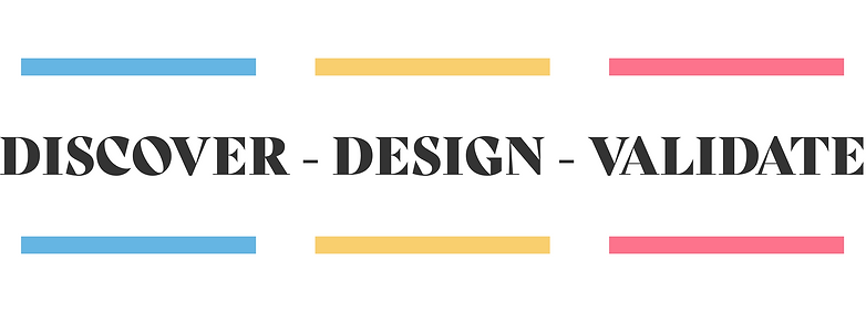
DESIGN PROCESS
This design process illustrates how I approached addressing the current problem:
I began by creating a project plan and setting deadlines for necessary deliverables to reach a solution.
DISCOVERY
SECONDARY RESEARCH
I began my research to understand what were some motivators that propelled users to attend events. I was also trying to understand user behaviors. Some of the key takeaways were as follows:
-
Users looked at incentives for attending free events eg. tokens or some tangible benefits
-
In most cases — leisure, recreation, and learning were the prime motivators
-
Users would like to be reminded of upcoming events to keep track
-
Users like to share events they are interested in with their friends — this process should be seamless
-
Users who book events alone may often have social anxiety that may act as a barrier to attending the event on the actual date
-
Users who pay for an event will most likely attend an event
-
Filling up an application to attend events i.e adding an exclusive factor acts as a motivator
-
Making the user aware that it was a good decision to book the event by sending follow-up emails with event speaker details etc helps to boost confidence
COMPETITOR RESEARCH
I conducted competitor research with direct competitors addressing a similar issue to assess feature similarities and areas for enhancement. Here are the findings from the analysis:

PRIMARY RESEARCH
The primary research methodology used was user interviews. Users were selected via a survey distributed to 15 participants, with selection based on the following criteria:
-
Users who have been to events and meetups in the past
-
Users who have prior experience using an application or website to book an event
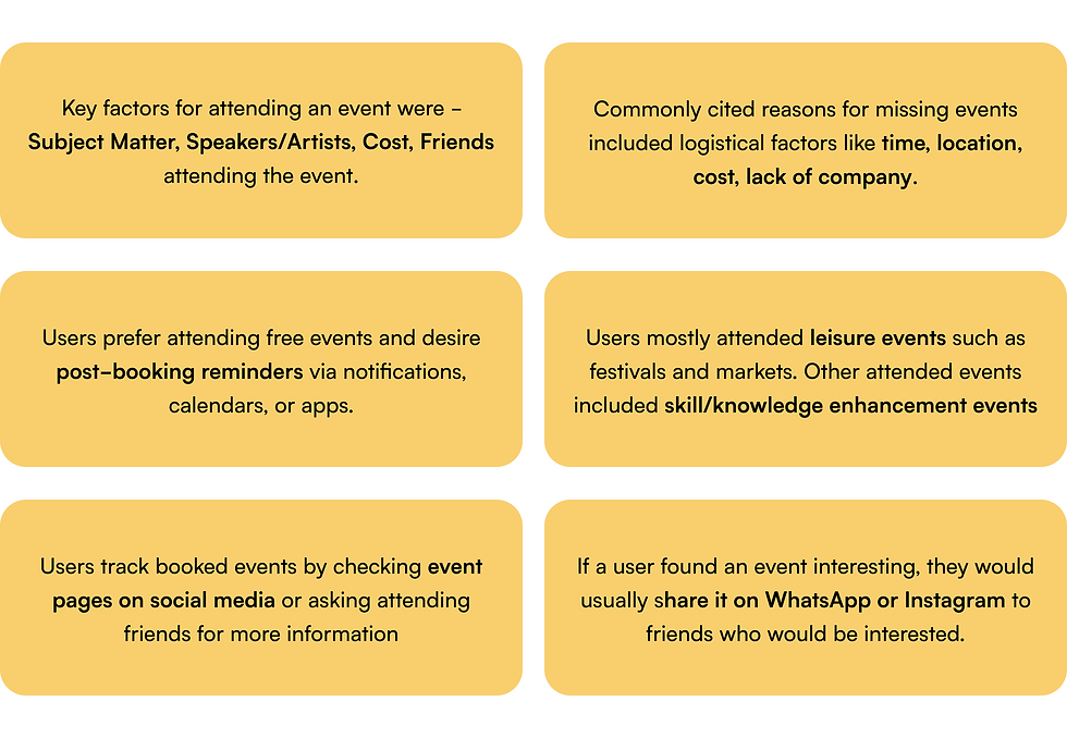
I conducted 5 user interviews, which revealed the following key insights:
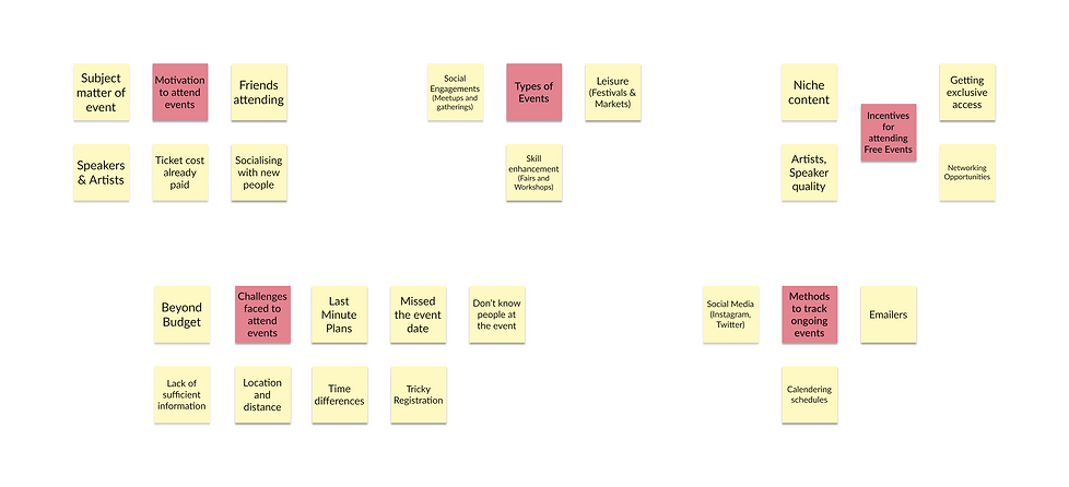
AFFINITY MAPPING
By leveraging the key insights gathered from user interviews, I was able to create logical groups to bucket information into categories
USER PERSONA
Using the gathered information, I crafted a user persona representing the ideal user likely to book an event on the application.

DESIGN
With the necessary information and insights, I began organizing, prioritizing, and categorizing them, starting the project's design phase.
INFORMATION ARCHITECTURE
I had access to existing user flows for core functions such as event booking. I then created the information architecture for post-booking flows, which was crucial to solve the problem.

SKETCHING
The next phase in the process involved creating sketches of the various screens derived from the user flows. This entailed drawing different pages and components on paper necessary for the app's functionality.

GUERILLA USABILITY TESTING
I conducted a series of Guerilla Usability Tests utilizing this paper prototype
Application used: POP by Marvel App
Tasks Assigned:
Was the information provided compelling enough to book the event?
Were there any roadblocks?
Were the post-booking reminders effective?
Were there any usability issues in the flows?
KEY INSIGHTS:
The users were able to register for the event successfully and found the information provided sufficient and useful. All users agreed that the email reminders, calendering option, and app push notifications would be useful to keep track of the upcoming event. There were no roadblocks encountered and the experience was fairly intuitive.
A user specifically liked the chat room interface where he could speak to participants attending the same event and socialize so as to have company to attend.
LOW FIDELITY WIREFRAMES
I started digitizing the paper sketches and created low-fidelity mock-ups in this next phase of the design process

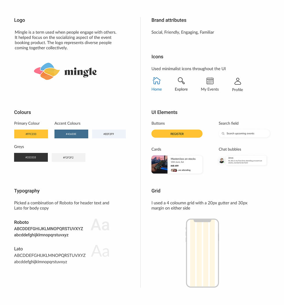
BRAND IDENTITY
The assignment brief gave me insights into the brand's personality and attributes. Based on these, I undertook the branding process and developed the subsequent brand identity for the product:
HIGH FIDELITY WIREFRAMES
I incorporated the branding into the low-fidelity wireframes to generate the high-fidelity mockups for the product 'Mingle'

Some of the key features I would like to highlight are as follows:

VALIDATE
In order to validate the design decisions and solutions, I conducted a series of usability tests.
USABILITY TESTING
As part of the testing process, I conducted 5 remote moderated usability tests using the high-fidelity prototype of the product. The participants were individuals who had previously booked and attended events. Here are the insights we gathered from the tests:
Issue 1: The chat feature on the "Confirmation page" seemed mandatory as it served as the primary call-to-action for the page. This posed a hindrance to users who preferred not to engage in chat and wanted to close it to proceed further.
Solution: Instead of relying solely on the cross symbol positioned at the top left-hand side of the screen, which wasn't very intuitive, I introduced a "Skip" option near the chat button. This change allowed users the flexibility to choose and proceed according to their preferences.

Issue 2: A user pointed out the need for more comprehensive information about the speakers or hosts of the event, which was lacking, to enhance engagement and interest.
Solution: I implemented a hover animation that provides additional information about each speaker/host.

CONCLUSION
This case study has provided me with a better understanding of how industry-specific problems can be tackled and effectively resolved through the design process. By following the methodologies of discovery, design, and validation, I was able to enhance the existing solution and promptly solve the problem in an already existing product with ease.
I found that having a project plan helped keep me on track with the deliverables and processes I needed to complete. This case study was a deep dive into solving real-world problems, and it has now prepared me to take on similar challenges with more confidence and skill! Thanks for reading my case study! 😊